
Springtime has sprung in New England, but it's still a little early for fields of flowers to pop up and trees to begin blooming, but that hasn't stopped me from looking for inspiration to creating fresh, spring illustrations. I started my search with a few things in mind: flowers, sunlight, and unique perspective. This led me down the rabbit hole of worm's eye view galore in wonderful, bright flower fields. I really wanted to capture the look of being a small animal looking through the flowers into the sky. This was great practice with closeup shots and dabbling in a more unique viewpoint.
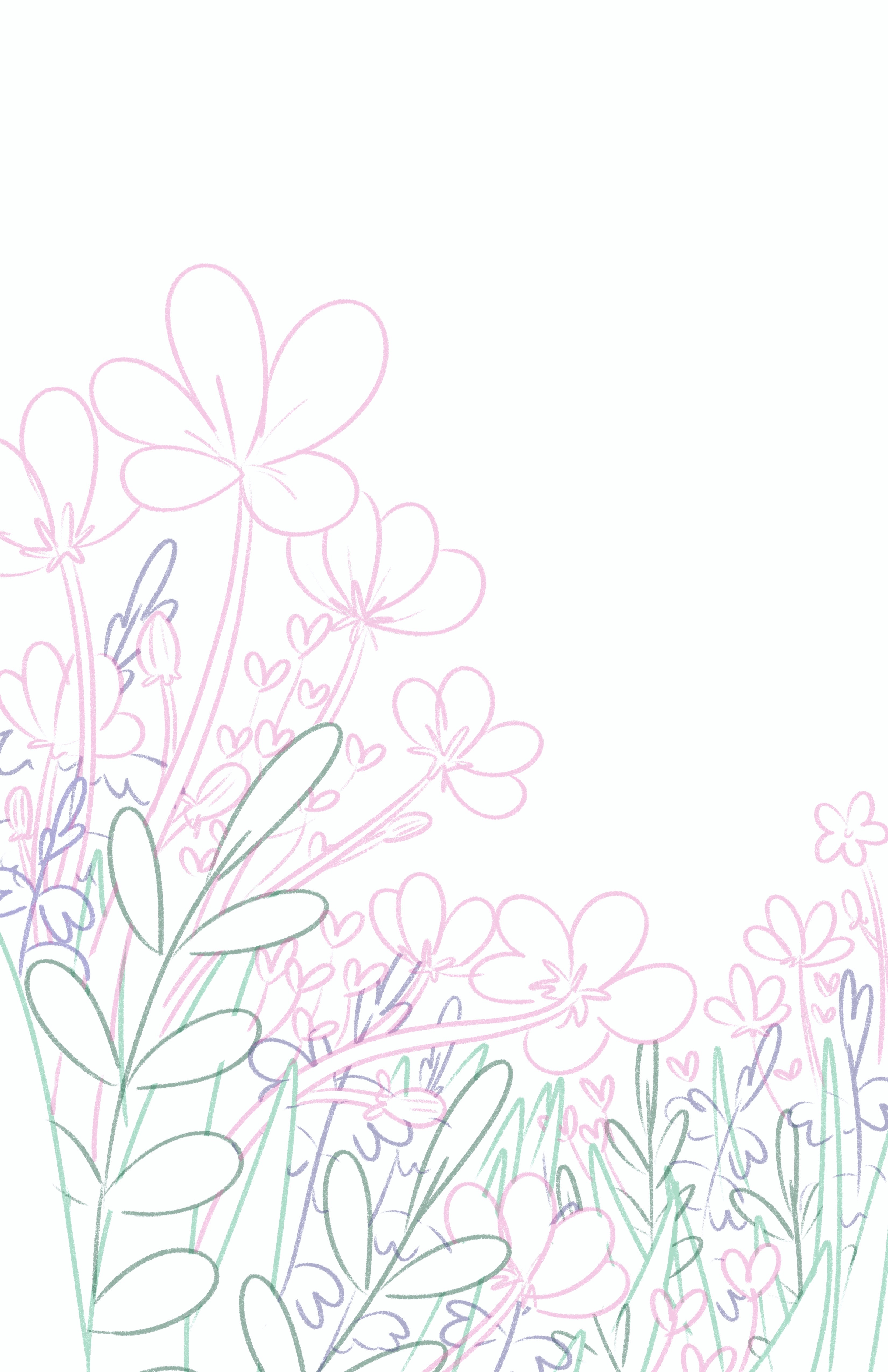
 I always begin any sketch phase with small, one inch thumbnails where the goal is to get a sense of composition
and important information that defines the illustration. I do several so I can have options to choose
from and not get wrapped up in just one.
They are all relatively showing the same ideas but with subtle differences
in viewpoint and direction of the flowers. Most of the thumbnails I created could move onto sketching/development
phase, but I went with the two strongest to move forward with. After the thumbnail phase, I used a thick, textured
brush to develop and flesh out the illustrations while keeping it loose and organic. I changed the color of the line art of flowers/foliage
in the distance to be lighter so i that didn't overlap the foreground and background elements while I outlined it.
I always begin any sketch phase with small, one inch thumbnails where the goal is to get a sense of composition
and important information that defines the illustration. I do several so I can have options to choose
from and not get wrapped up in just one.
They are all relatively showing the same ideas but with subtle differences
in viewpoint and direction of the flowers. Most of the thumbnails I created could move onto sketching/development
phase, but I went with the two strongest to move forward with. After the thumbnail phase, I used a thick, textured
brush to develop and flesh out the illustrations while keeping it loose and organic. I changed the color of the line art of flowers/foliage
in the distance to be lighter so i that didn't overlap the foreground and background elements while I outlined it.
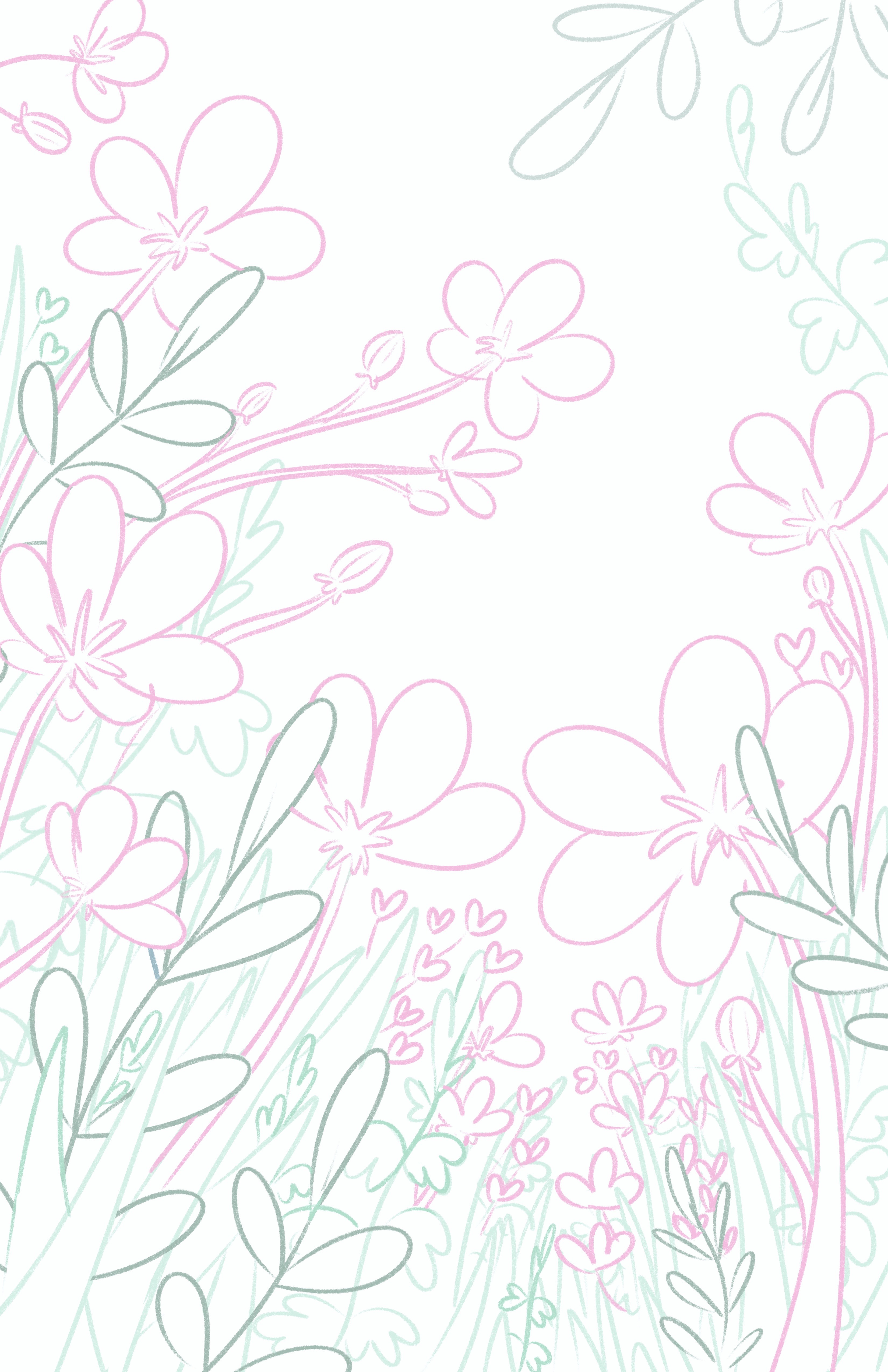
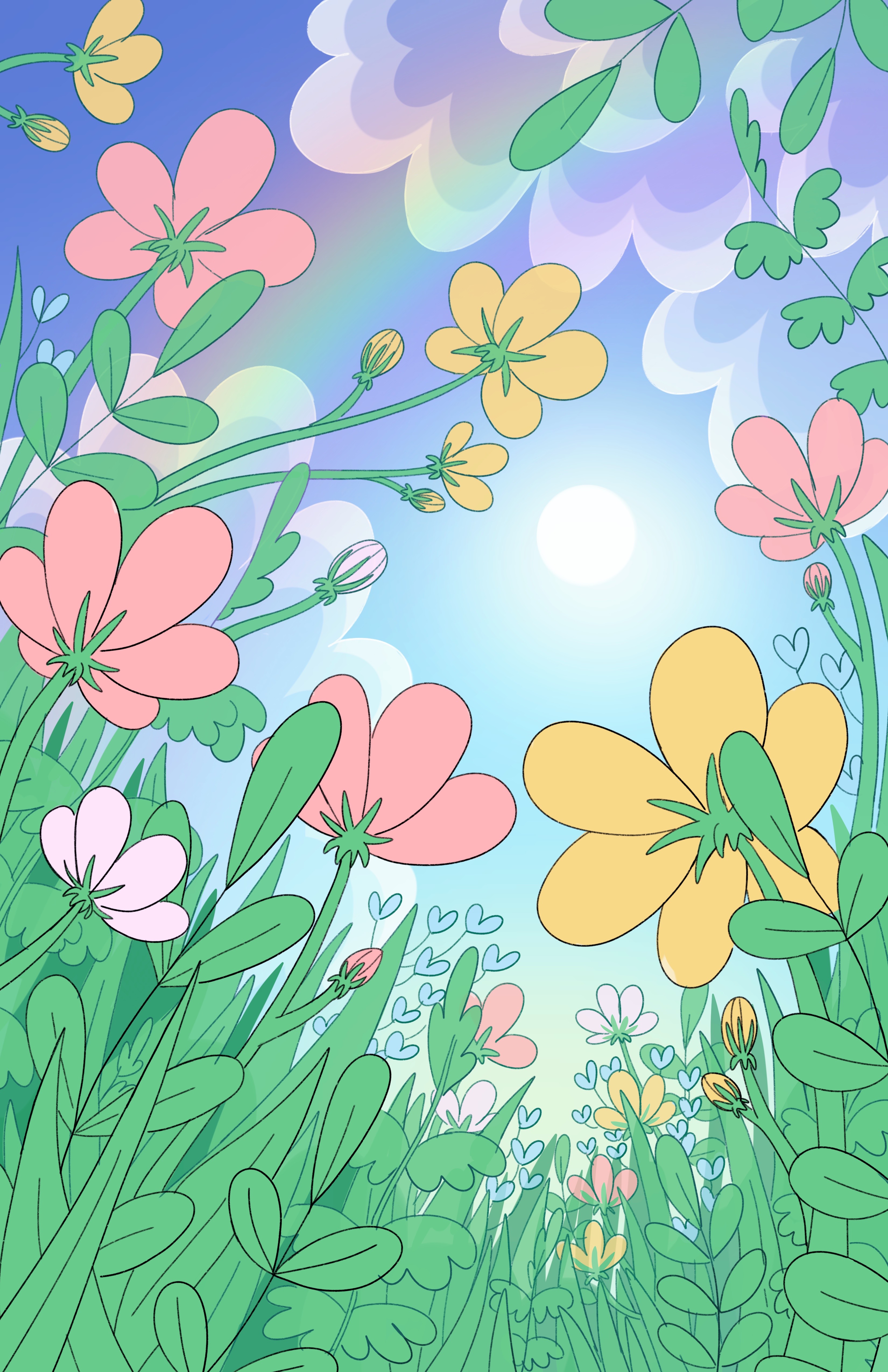
 The line art of these two illustrations were straight forward as there were only two "layers" I needed to differentiate between and
not the typical amount seen in my larger landscapes. The only tricky bit I had to get over were the false backgrounds behind the
foliage. I didn't want to have as much detail as the flowers and plants do in the front, so I opted to not include any lines in the
background and will illustrate a vague representation of plants in the distance later down in the coloring phase. These were a test
to "less is more" as I only included the most important information with the line art while leaving room for breathing and interpretation.
The line art of these two illustrations were straight forward as there were only two "layers" I needed to differentiate between and
not the typical amount seen in my larger landscapes. The only tricky bit I had to get over were the false backgrounds behind the
foliage. I didn't want to have as much detail as the flowers and plants do in the front, so I opted to not include any lines in the
background and will illustrate a vague representation of plants in the distance later down in the coloring phase. These were a test
to "less is more" as I only included the most important information with the line art while leaving room for breathing and interpretation.
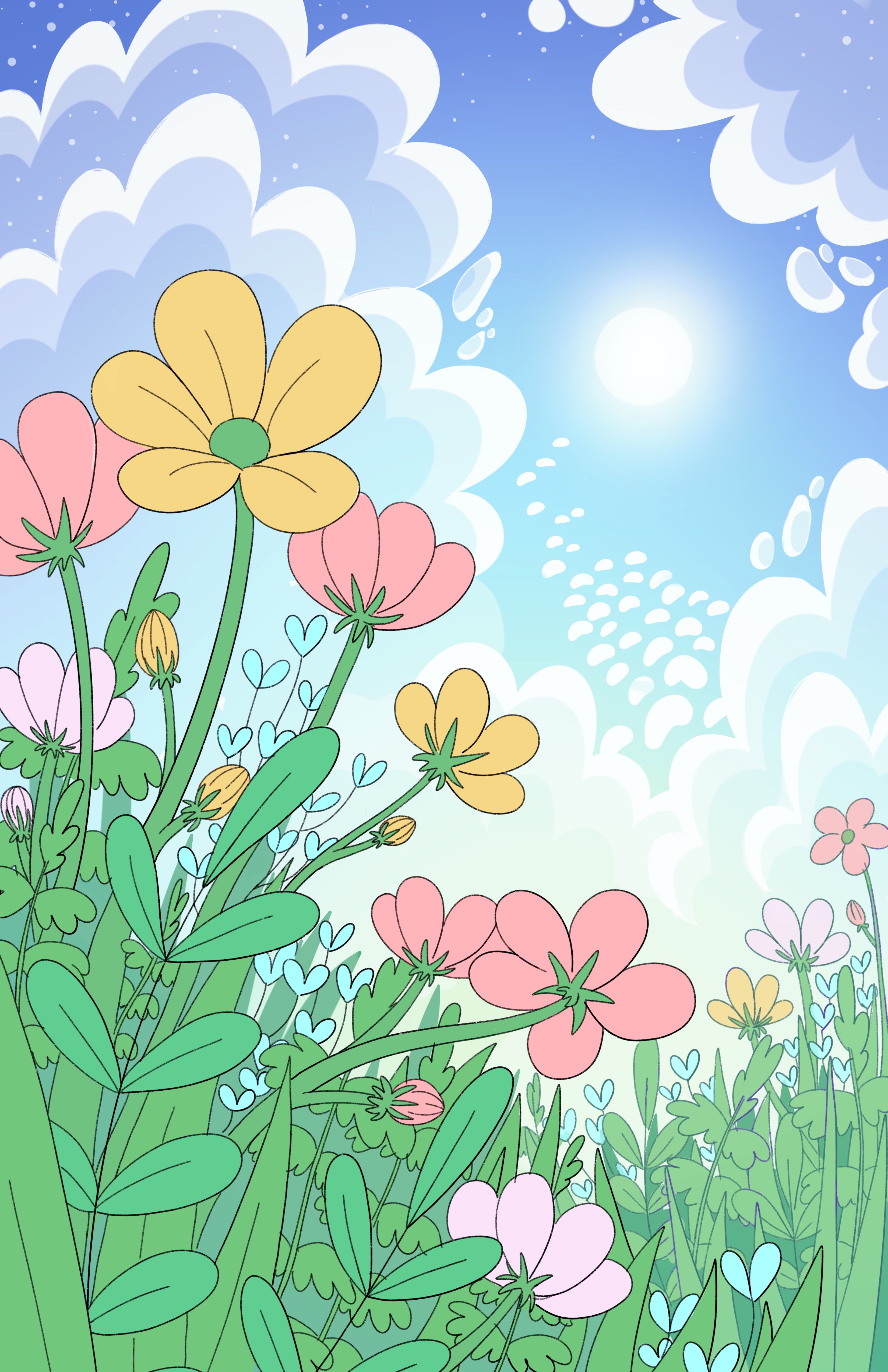
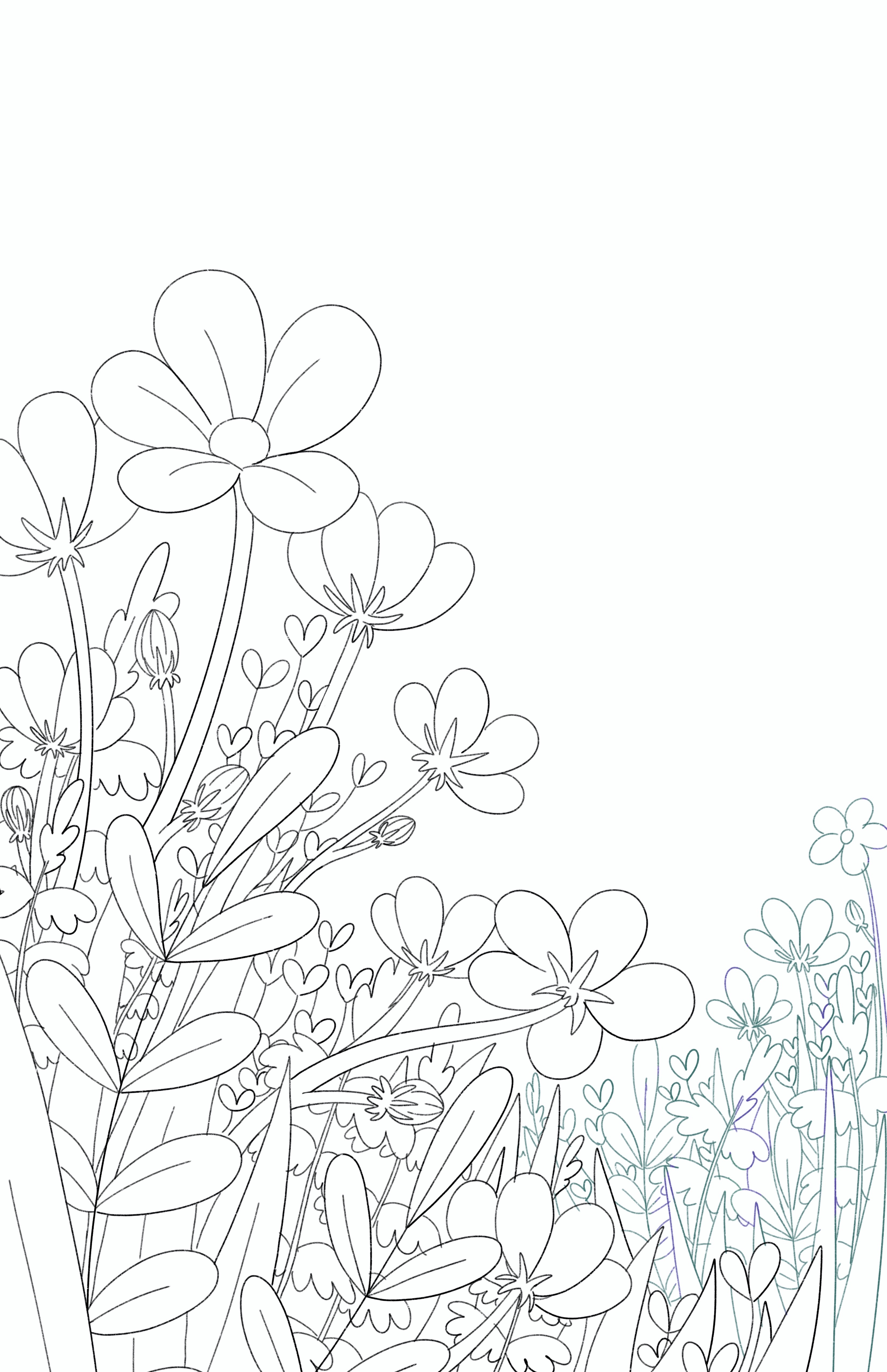
 These two illustrations reminded me of coloring books as I filled in the separate layers of colors. It makes me want to make a coloring
book one day! Flatting these illustrations was straightforward and only required 4 separate layers in the foreground and background. I
grouped the background layers together to make it easier to manage when I render later on. Sometimes my flat illustrations
have a better story behind them, but these pieces only had 1-5 differing elements that will all essentially be like one another in
color and texture (besides the flowers, of course). I chose the flower colors based on springtime colors that will pop over the greens and blues
so I went with white, pink, and yellow for the main flowers and a blue/purple for the smaller clusters of flowers.
These two illustrations reminded me of coloring books as I filled in the separate layers of colors. It makes me want to make a coloring
book one day! Flatting these illustrations was straightforward and only required 4 separate layers in the foreground and background. I
grouped the background layers together to make it easier to manage when I render later on. Sometimes my flat illustrations
have a better story behind them, but these pieces only had 1-5 differing elements that will all essentially be like one another in
color and texture (besides the flowers, of course). I chose the flower colors based on springtime colors that will pop over the greens and blues
so I went with white, pink, and yellow for the main flowers and a blue/purple for the smaller clusters of flowers.

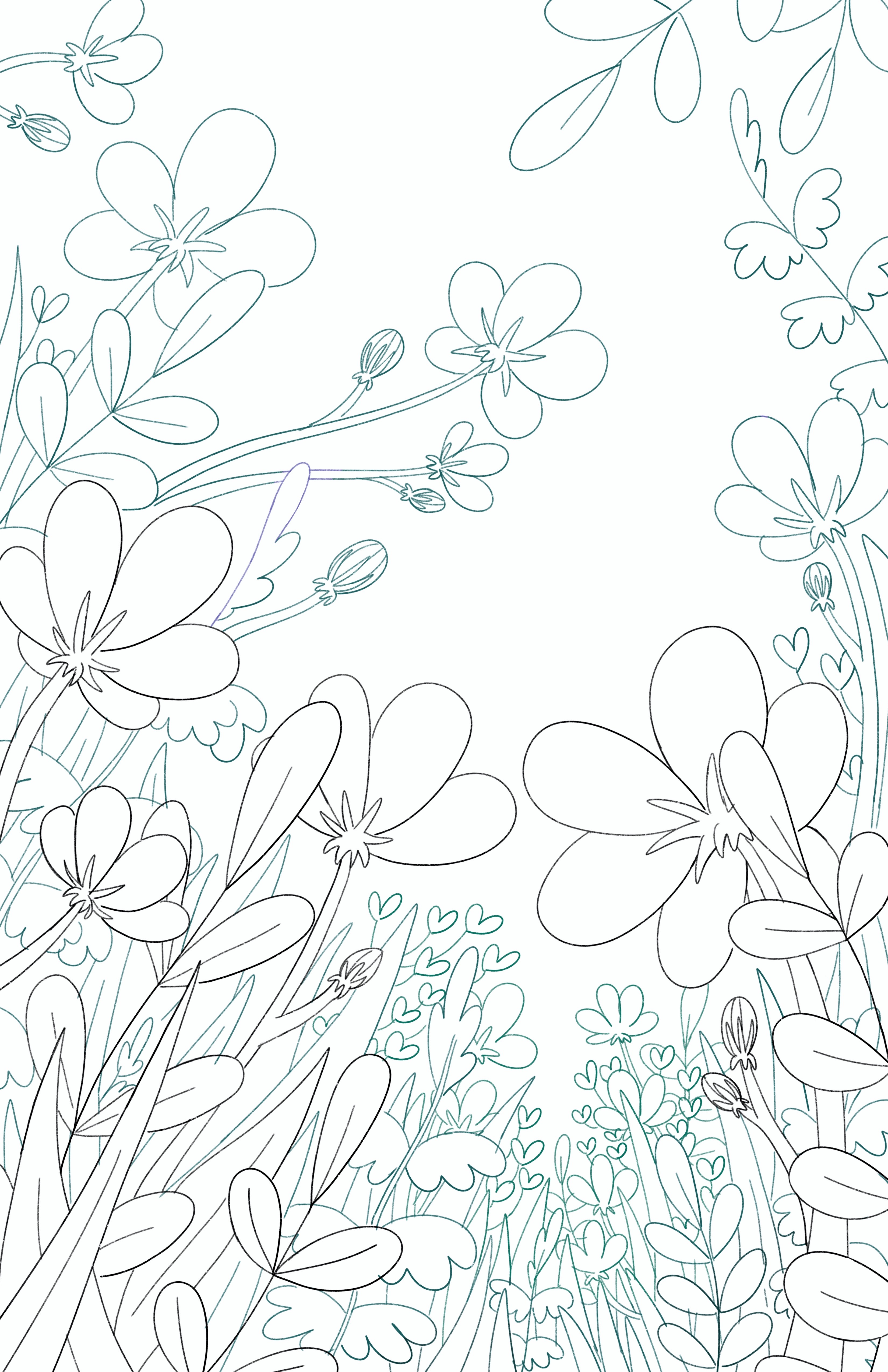
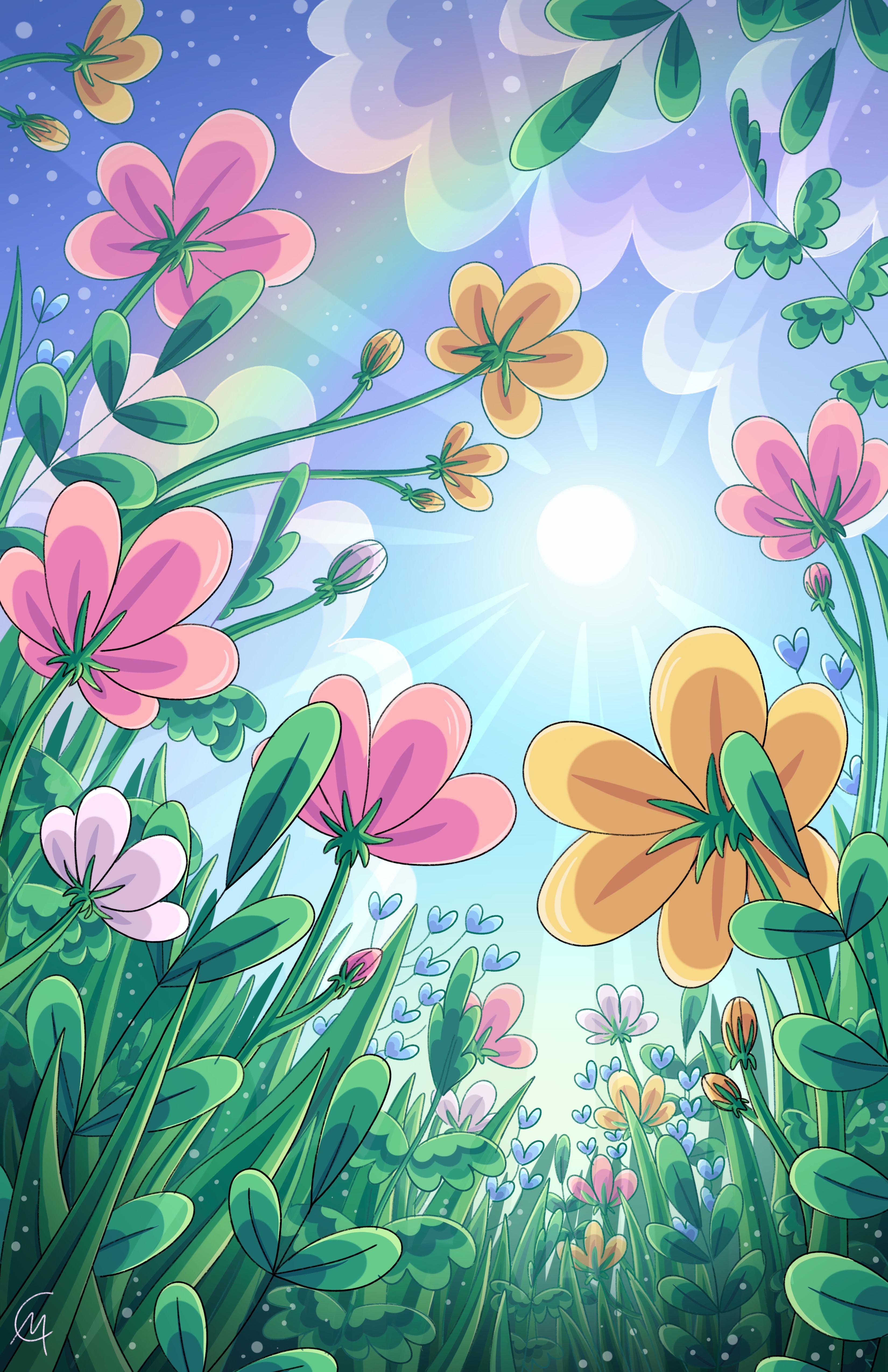 Since these illustrations lacked the typical trees/grass/bushes in most of my illustrations, these only took an hour or two to complete which
was very nice and a little break from my typical work. I worked through each layer from top to bottom, starting with the ferns and ending
with the flowers. My technique for these was to follow the shape of the objects and continually adding shades until my desired darks come to
life. These were a "trust the process" type of illustrations where it only came together when I added the final dark stroke and additional
highlight to each object as adding additional layer looked messier and messier until...it didn't. Luckily, the sun played a role in the composition
and lighting, so I only had to worry about shading closest to the camera/the ground and the highlights would always be on the side closest to the sun.
I made sure that the background foliage and flowers were a lower opacity to mimic atmospheric perspective and so that the sunlight can pierce
through better to give more depth. This led to me adding additional sunlight rays for a more dramatic look and feel. Last, I rendered the dark backdrop
behind the foliage by using a tapered round brush of the second darkest shade and used a flick motion to mimic far away grass. This was a nice touch that
made the field feel vast with little detail. I would love to make similar illustrations like these in the future, perhaps trees instead of flowers or
maybe different fields of flowers. These were great study illustrations for a unique perspective and close-up on different foliage.
Since these illustrations lacked the typical trees/grass/bushes in most of my illustrations, these only took an hour or two to complete which
was very nice and a little break from my typical work. I worked through each layer from top to bottom, starting with the ferns and ending
with the flowers. My technique for these was to follow the shape of the objects and continually adding shades until my desired darks come to
life. These were a "trust the process" type of illustrations where it only came together when I added the final dark stroke and additional
highlight to each object as adding additional layer looked messier and messier until...it didn't. Luckily, the sun played a role in the composition
and lighting, so I only had to worry about shading closest to the camera/the ground and the highlights would always be on the side closest to the sun.
I made sure that the background foliage and flowers were a lower opacity to mimic atmospheric perspective and so that the sunlight can pierce
through better to give more depth. This led to me adding additional sunlight rays for a more dramatic look and feel. Last, I rendered the dark backdrop
behind the foliage by using a tapered round brush of the second darkest shade and used a flick motion to mimic far away grass. This was a nice touch that
made the field feel vast with little detail. I would love to make similar illustrations like these in the future, perhaps trees instead of flowers or
maybe different fields of flowers. These were great study illustrations for a unique perspective and close-up on different foliage.