
One benefit of living in New England is the abundance of fiery colors during the season of autumn. Autumn is one of my favorite seasons, outside of spring, of course. The windy days, falling leaves, apple picking, pie eating, and gorgeous hue of warm colors make this a memorable and nostalgic season. I love illustrating environments and scenes, and in true New Englander fashion, I practiced/study the beauty of Autumn around me. I looked at loads of references from local photographers and fellow artists for inspiration. I knew these pieces would be strictly landscape with no animals/subjects, just the beauty of autumn. This was also good practice to strengthen of my Autumnal color pallet to keep a consistent, but warm take on my style. I sketched out over 15 thumbnails, and selected 2 that I felt most strongly about. This is the process from lineart to rendering.
 After developing and fleshing out the initial thumbnail, I began the line art process. I use a custom brush that has a bit of grit and texture to contrast the flat colors later on.
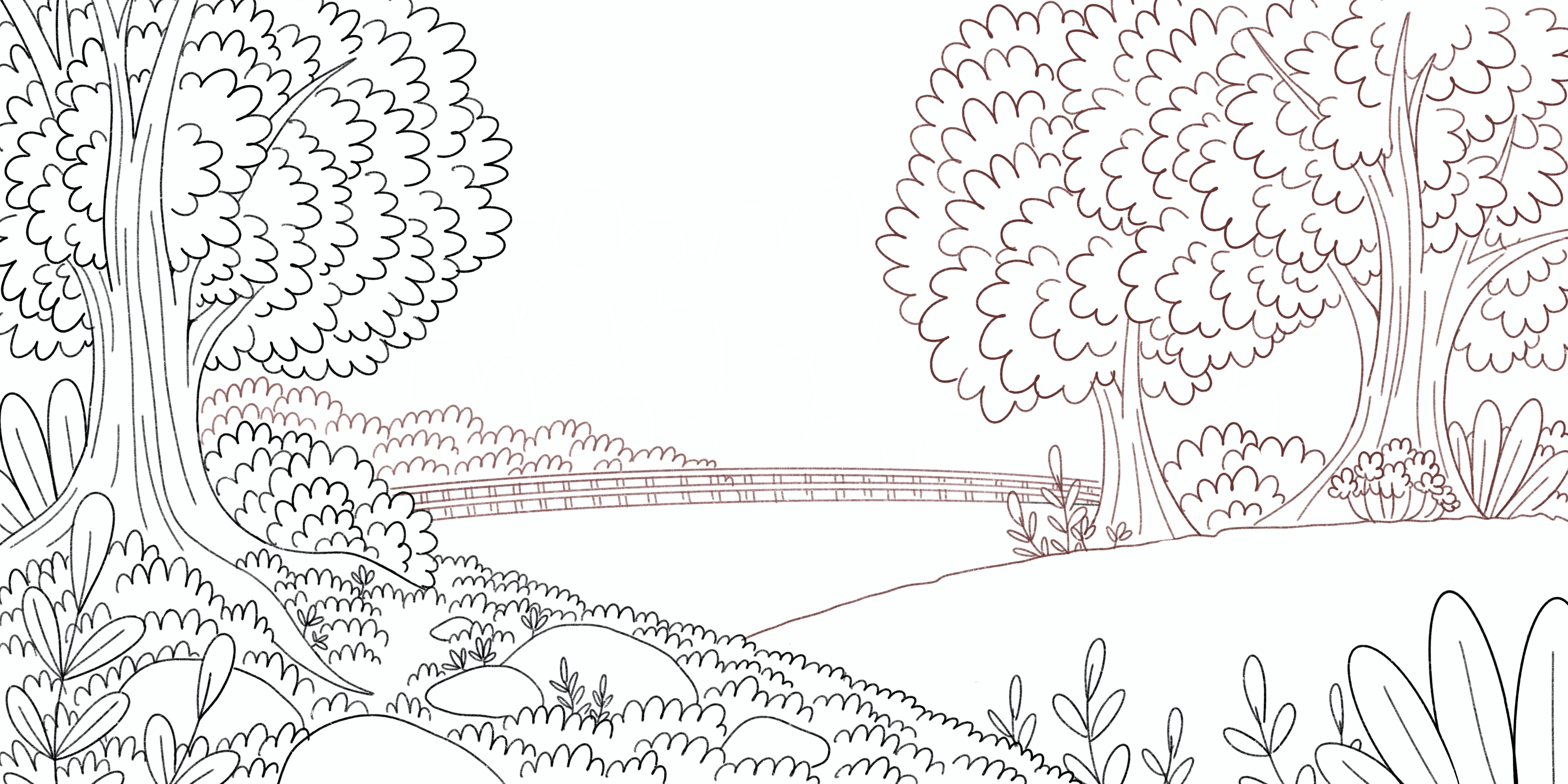
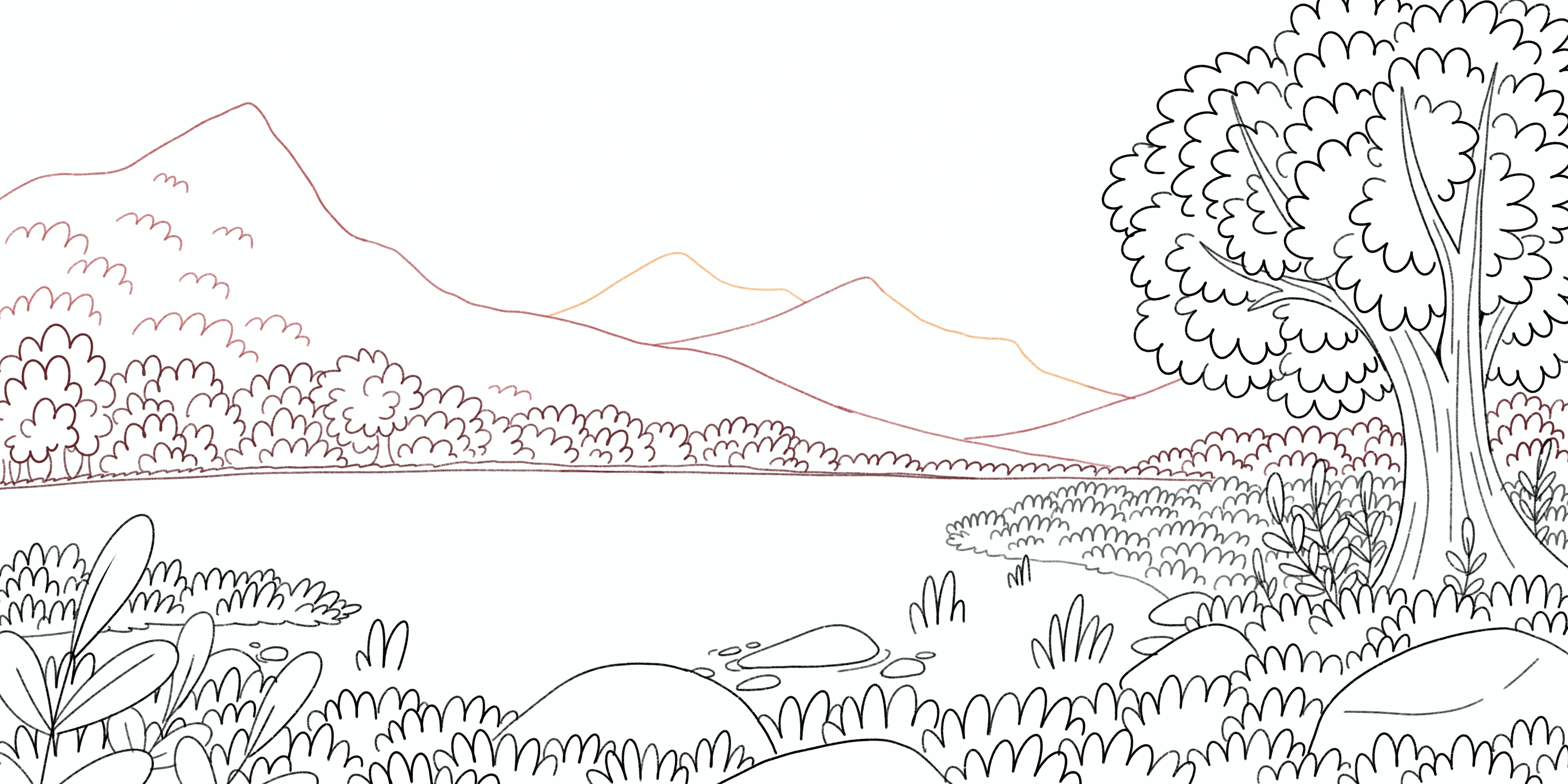
After many previous fails and mistakes found later on with line art, I separated the line art into 1-7 layers. This is to ensure each section is accounted for and so I can visually separate the foreground, mid-ground, and background before I flat the piece.
After developing and fleshing out the initial thumbnail, I began the line art process. I use a custom brush that has a bit of grit and texture to contrast the flat colors later on.
After many previous fails and mistakes found later on with line art, I separated the line art into 1-7 layers. This is to ensure each section is accounted for and so I can visually separate the foreground, mid-ground, and background before I flat the piece.
 As the viewer looks further into the horizon, the line art will also lighten and colored to match the surrounding area better. This pushes back background elements as a black line where the furthest element would flatten the image and it would lack so much depth.
I will tweak these colors as the process progresses to make sure the line art doesn't look out of place and feels right in the surrounding elements. This may include getting rid of some lines down the line.
As the viewer looks further into the horizon, the line art will also lighten and colored to match the surrounding area better. This pushes back background elements as a black line where the furthest element would flatten the image and it would lack so much depth.
I will tweak these colors as the process progresses to make sure the line art doesn't look out of place and feels right in the surrounding elements. This may include getting rid of some lines down the line.
 After the line art is all said and done, I move onto "flatting" my colors. This comprises using a tapered round brush
to fill in the line art like a coloring book. Like the line art, I separate different elements with respective colors
in separate layers so there is no confusion and I can easily find the layers later during the render phase. There are
probably so many ways to make this process easier for myself, but I love following my line art than filling it in.
It's satisfying and one step I look forward to the most. During this step I'll also create the sky gradient along
with the clouds so I can get a feel of where the lighting and focus will be before I render. Rendering the clouds
before everything else is an easy first step that doesn't take long, gives me a sense of accomplishment, and motivates me to finish the illustration.
After the line art is all said and done, I move onto "flatting" my colors. This comprises using a tapered round brush
to fill in the line art like a coloring book. Like the line art, I separate different elements with respective colors
in separate layers so there is no confusion and I can easily find the layers later during the render phase. There are
probably so many ways to make this process easier for myself, but I love following my line art than filling it in.
It's satisfying and one step I look forward to the most. During this step I'll also create the sky gradient along
with the clouds so I can get a feel of where the lighting and focus will be before I render. Rendering the clouds
before everything else is an easy first step that doesn't take long, gives me a sense of accomplishment, and motivates me to finish the illustration.
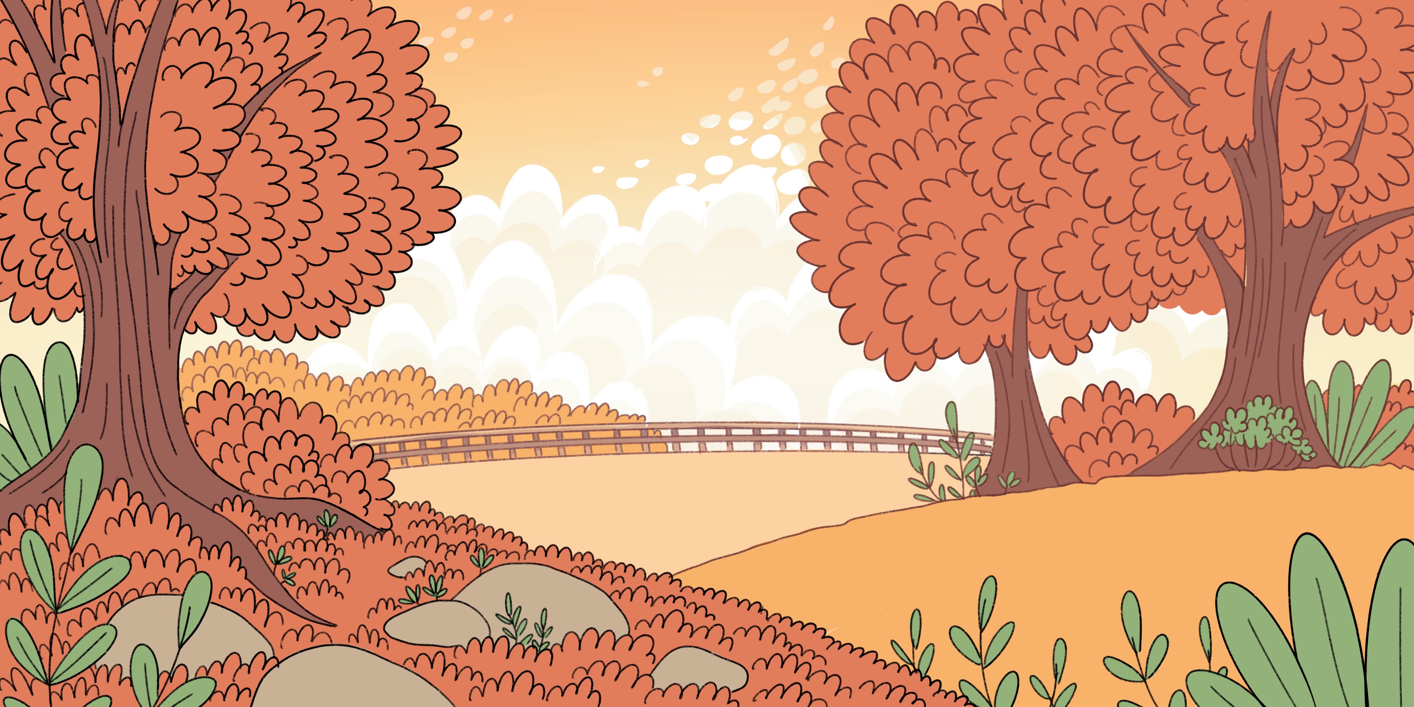
 There are slight differences in the flats seen in these two illustrations. I have 3 approaches to flatting the colors. One is completely random,
colors not matching final product, various hues and wild color pallet. This is for very complex pieces with lots of elements, so I won't miss small
elements during rendering. The other two are variants off of eachother, whatever I'm feeling and what is important to separate and give importance.
The top Illustration I wanted to make sure I knew the foreground was as prominent as the trees, whereas I muted/lightened the elements that
will get pushed back into the background. I approached the bottom illustration slightly differently, as I didn't have as many differing elements
so I could use the same shades for multiple elements, like the tree in the forefront and the ones lining the lake. There is no real concrete
method or reason I flatted these differently from eachother, but it's a tried and trued method that makes things easier to read and differentiate
so that I have an easier time rendering and understanding the lighting and what is important in the illustration.
There are slight differences in the flats seen in these two illustrations. I have 3 approaches to flatting the colors. One is completely random,
colors not matching final product, various hues and wild color pallet. This is for very complex pieces with lots of elements, so I won't miss small
elements during rendering. The other two are variants off of eachother, whatever I'm feeling and what is important to separate and give importance.
The top Illustration I wanted to make sure I knew the foreground was as prominent as the trees, whereas I muted/lightened the elements that
will get pushed back into the background. I approached the bottom illustration slightly differently, as I didn't have as many differing elements
so I could use the same shades for multiple elements, like the tree in the forefront and the ones lining the lake. There is no real concrete
method or reason I flatted these differently from eachother, but it's a tried and trued method that makes things easier to read and differentiate
so that I have an easier time rendering and understanding the lighting and what is important in the illustration.
 The rendering step is where the illustration comes to life and breathes. Every element will get the same treatment of 4-5 "layers" of shades with 1 "layer. "
of highlight depending on the texture of the object. For example, the trees don't have additional highlights, as the lightest color is the base, whereas the
rocks which glisten in the sunlight will have an additional highlight to showcase the "wet" "shiny" texture that differentiates it from the dry-looking brush
around it. Sometimes I'll add little "glitter" dots and specks on these rocks and similar elements to add as a bit of interesting texture to the flat,
smooth blobs of shading and it makes it look magical and sparkly! Back on topic, I will almost always start with the main trees or any foreground elements
like the plants in the foreground to get a sense of lighting and work my way from the foreground to the background.
The rendering step is where the illustration comes to life and breathes. Every element will get the same treatment of 4-5 "layers" of shades with 1 "layer. "
of highlight depending on the texture of the object. For example, the trees don't have additional highlights, as the lightest color is the base, whereas the
rocks which glisten in the sunlight will have an additional highlight to showcase the "wet" "shiny" texture that differentiates it from the dry-looking brush
around it. Sometimes I'll add little "glitter" dots and specks on these rocks and similar elements to add as a bit of interesting texture to the flat,
smooth blobs of shading and it makes it look magical and sparkly! Back on topic, I will almost always start with the main trees or any foreground elements
like the plants in the foreground to get a sense of lighting and work my way from the foreground to the background.
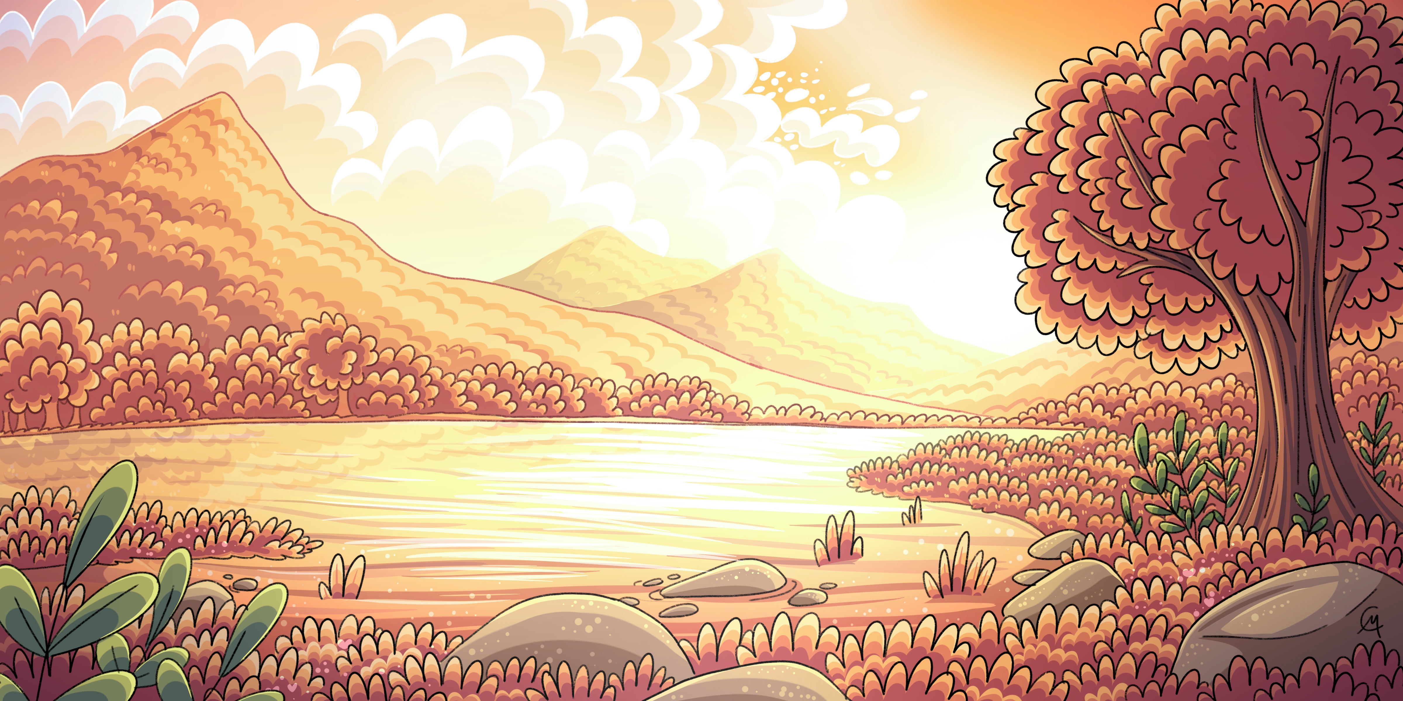 In the top illustration, I experimented with adding a layer on top of the trees to change up the hues slightly to give more variation within the foliage.
I honest love the way it looks, and it means that I won't need to adjust my color pallet of trees anytime I want slight variations in the hues. If anyone is
interested, I apply an adjustment layer set on soft/hard light, add my desired shift in hue, then apply at 30-40% opacity. I also use these adjustment layers for
the stark lighting that shines behind the trees. These two illustrations, along with all my recent illustrations, show atmospheric
perspective that allows background elements to be pushed back further and blend in with the sky. I accomplish this by rendering as usual, but when I'm done
I'll set the opacity back 5-10%. This will continue every layer back until the furthest element is 50% or less. This can definitely be seen most in the
bottom illustration where the mountains seem to blend into the sky, whereas the tree and foreground elements remain at 100%. This is how I accomplish dynamic,
full of depth, breathing worlds you can step right into with my flat, cartoony style.
In the top illustration, I experimented with adding a layer on top of the trees to change up the hues slightly to give more variation within the foliage.
I honest love the way it looks, and it means that I won't need to adjust my color pallet of trees anytime I want slight variations in the hues. If anyone is
interested, I apply an adjustment layer set on soft/hard light, add my desired shift in hue, then apply at 30-40% opacity. I also use these adjustment layers for
the stark lighting that shines behind the trees. These two illustrations, along with all my recent illustrations, show atmospheric
perspective that allows background elements to be pushed back further and blend in with the sky. I accomplish this by rendering as usual, but when I'm done
I'll set the opacity back 5-10%. This will continue every layer back until the furthest element is 50% or less. This can definitely be seen most in the
bottom illustration where the mountains seem to blend into the sky, whereas the tree and foreground elements remain at 100%. This is how I accomplish dynamic,
full of depth, breathing worlds you can step right into with my flat, cartoony style.