
A study between warm light and cool shadows
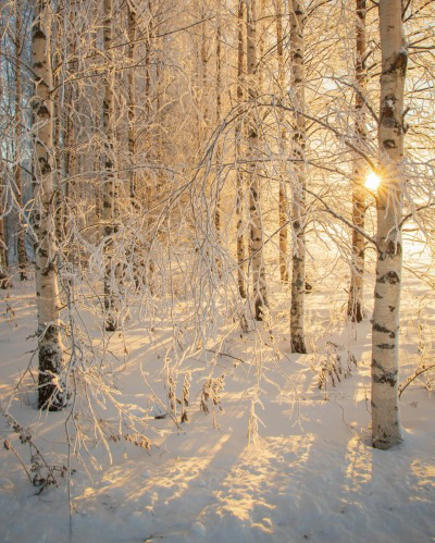
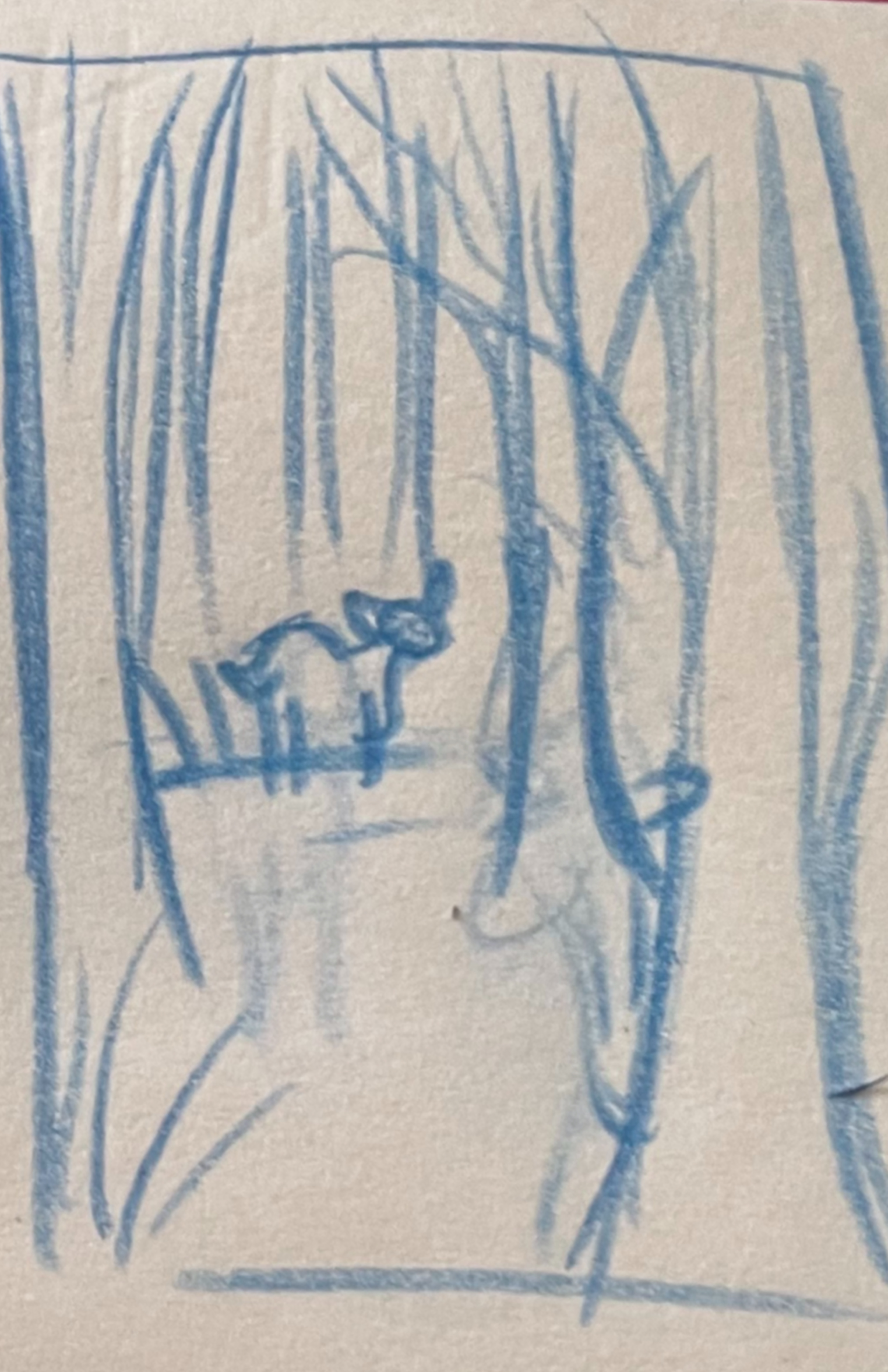 This winter in Northern New England has shown its true snowy nature. Storm after storm, snow stacking up, branches drooping from the weight of precipitation, and ground cover becoming increasingly white, this winter will be one to remember. All of this snow has sparked inspiration within my landscape illustrations, so much so that it’s all I want to draw. Normally I’d create a few winter themed illustrations then return to my normal bright, green, sunshine, illustrations, however this year is different, I wanted to figure out winterscapes in my art style and produce a good sum before the snow starts to melt. One thing I wanted to practice was the relationship between a warm, glowing lightsource with dark, cool toned shadows. As I was scrolling for inspiration on pinterest I stumbled upon my inspiration/reference. This photo depicts a birch forest smothered in deep snow with a warm light source peaking behind the trees leaving the rest of the image contrasted with cool shadows. Initially, I was going to illustrate this photo in my style, however I felt it would be a bit boring to draw, and it lacked an interesting focal point. After some thumbnails I landed on this one: a solitary deer walking amongst a birch wintery forest, a small brown deer standing out amongst the white snow. Most of the time, I toss out these quick 5 second thumbnails without documenting it, but I managed to save this one to share with you all. I remember quickly sketching this on a sticky note at work, focusing on shape, composition, and movement instead of detail.
Line art
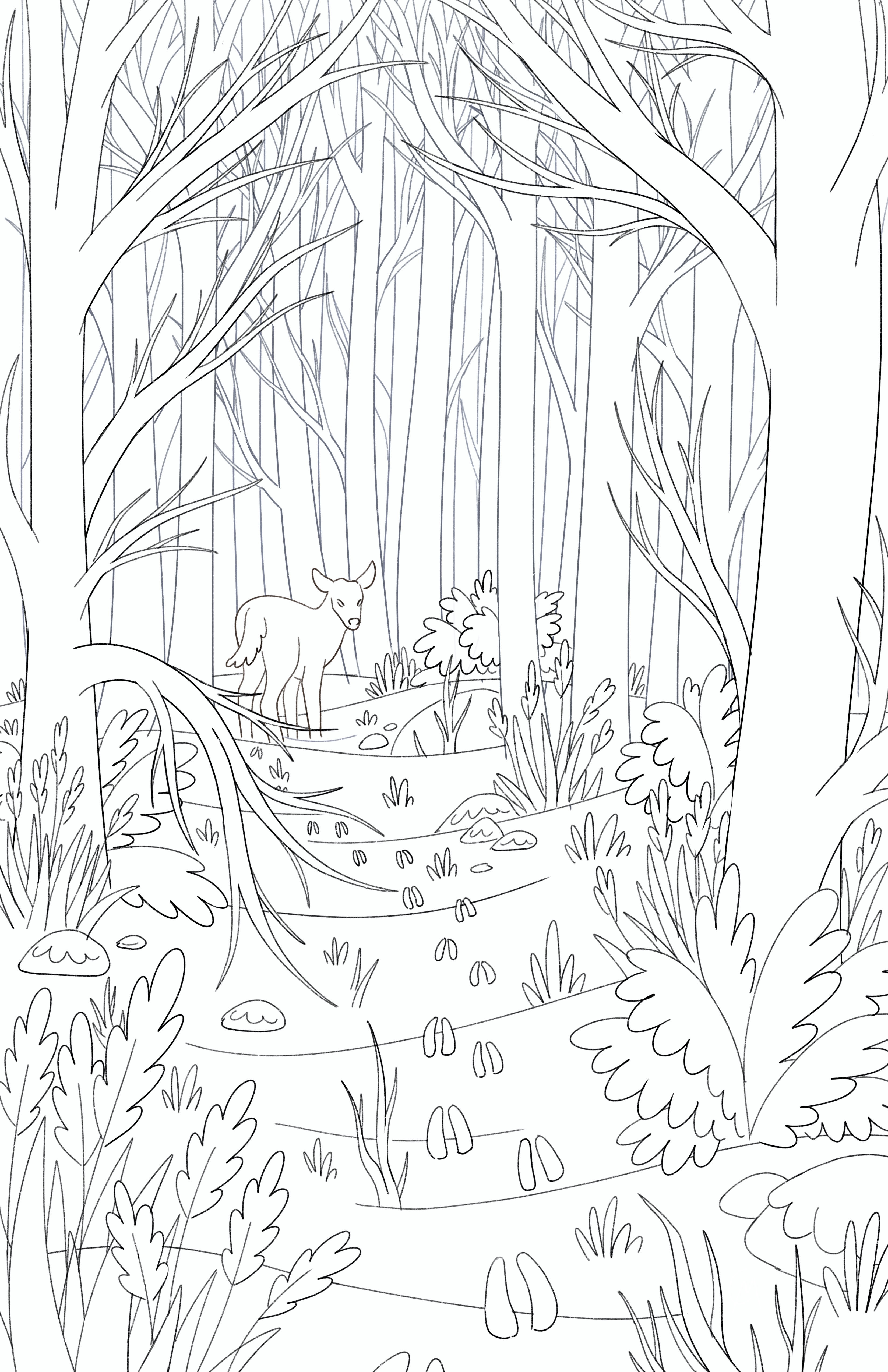 I unfortunately forgot to save the final sketch after developing this illustration from the initial thumbnail, however the final lineart is essentially what the sketch looked like, but more refined. Unlike the reference image, I added a diverse array of ground foliage, from dried plants, small leafless trees, and small conifers to break up the space and add interest. The deer looks back at us, journeying deeper in the snowy forest leaving behind a trail of footprints that’ll one day be lost. Another difference is that the reference image depicts a sparse woodland, without a clear trail, bordering a large field where the light source originates. Whereas I changed it to a remote forest with a clear trail that leads up to the wandering deer, and for an open space for the light source to emerge and spread. This is the beautiful thing about reference images, you can start with one thing, but it leads you down a road of tweaks, changes, thoughts/ideas, and choices that’ll create a new, original piece of artwork. I’m sure I could’ve come up with something similar, but the reference is a great starting point that’ll help me think more about my choices and what I’ll change about it to better suit my idea. While outlining this piece, I already had light and perspective in mind, so I made sure to separate the foreground elements from the background elements as well as the tree layers. This is to make adjusting the colors easier later on when I figure out the lighting situation.
Flat Colors
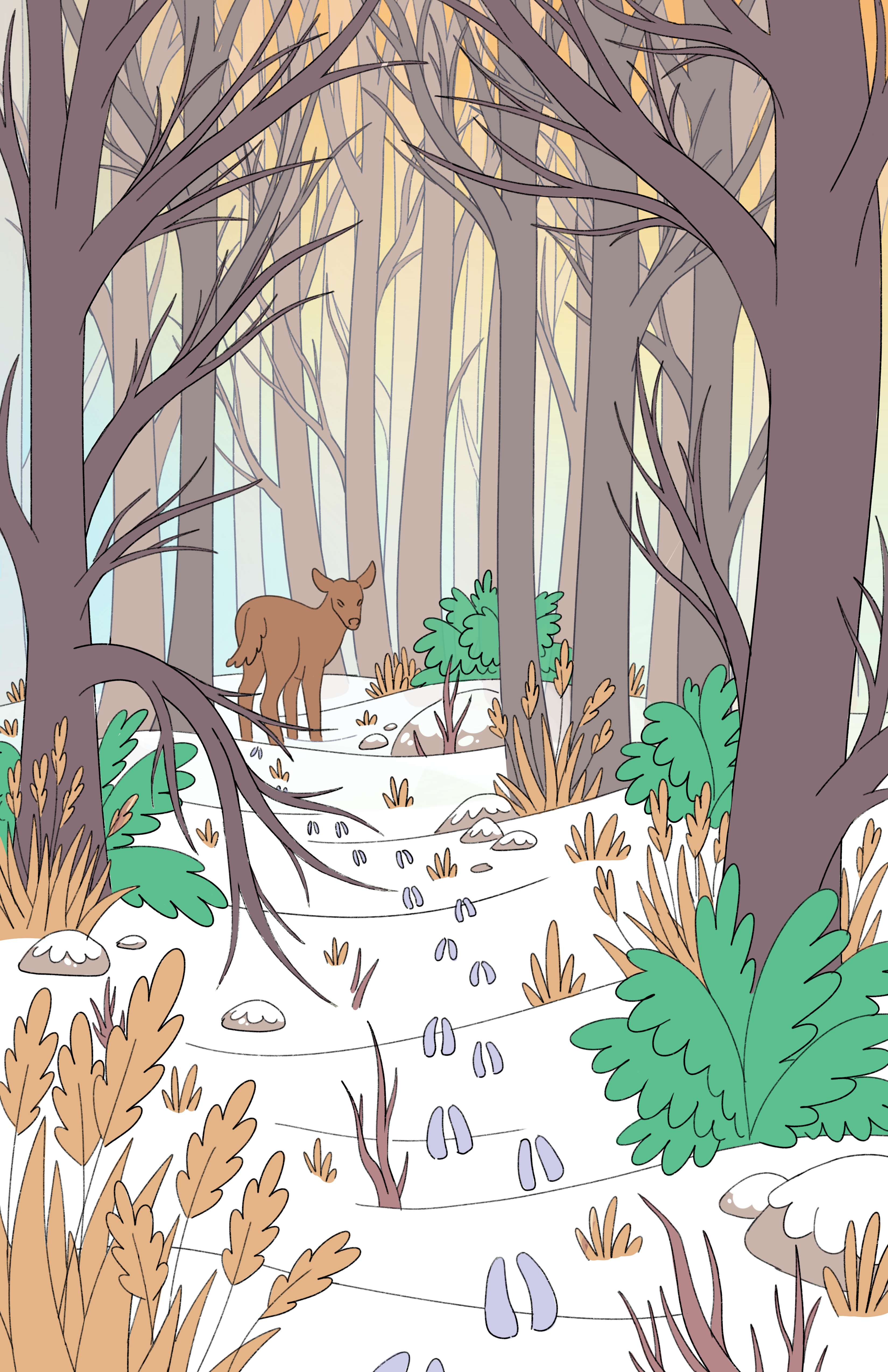
While painting the flat layers, I made sure to visually separate the foreground trees from the background trees so I could see how the lights and shadows will play out because making these trees the paper white of birch out of the gate didn’t look quite right, and this made it easier to see what I was going to attempt. Elements that would be later covered in snow are left flat as it’s easier to add them later during the rendering phase after shading them. Here I also added my background. The background went through many renditions, from pure yellow, pure orange, a yellow-orange gradient, to adding some white in areas, but I landed on having an orange-yellow-blue gradient because the blue helps contrast and unites the warm and cool tones that I’ll be playing around with while rendering.
Rendering
I started rendering the small details like the foliage and rocks, not thinking too much about the dominant light source as they are small enough that it won’t matter later down the line. Then I moved onto the snow, adding snow on the small conifers, rocks, leafless shrubs, and the ground cover. This was straightforward since I have a palette that has the colors I typically use to shade snow, and I add a speckled/blotchy texture to the snow for intrigue and to break up the monotony. 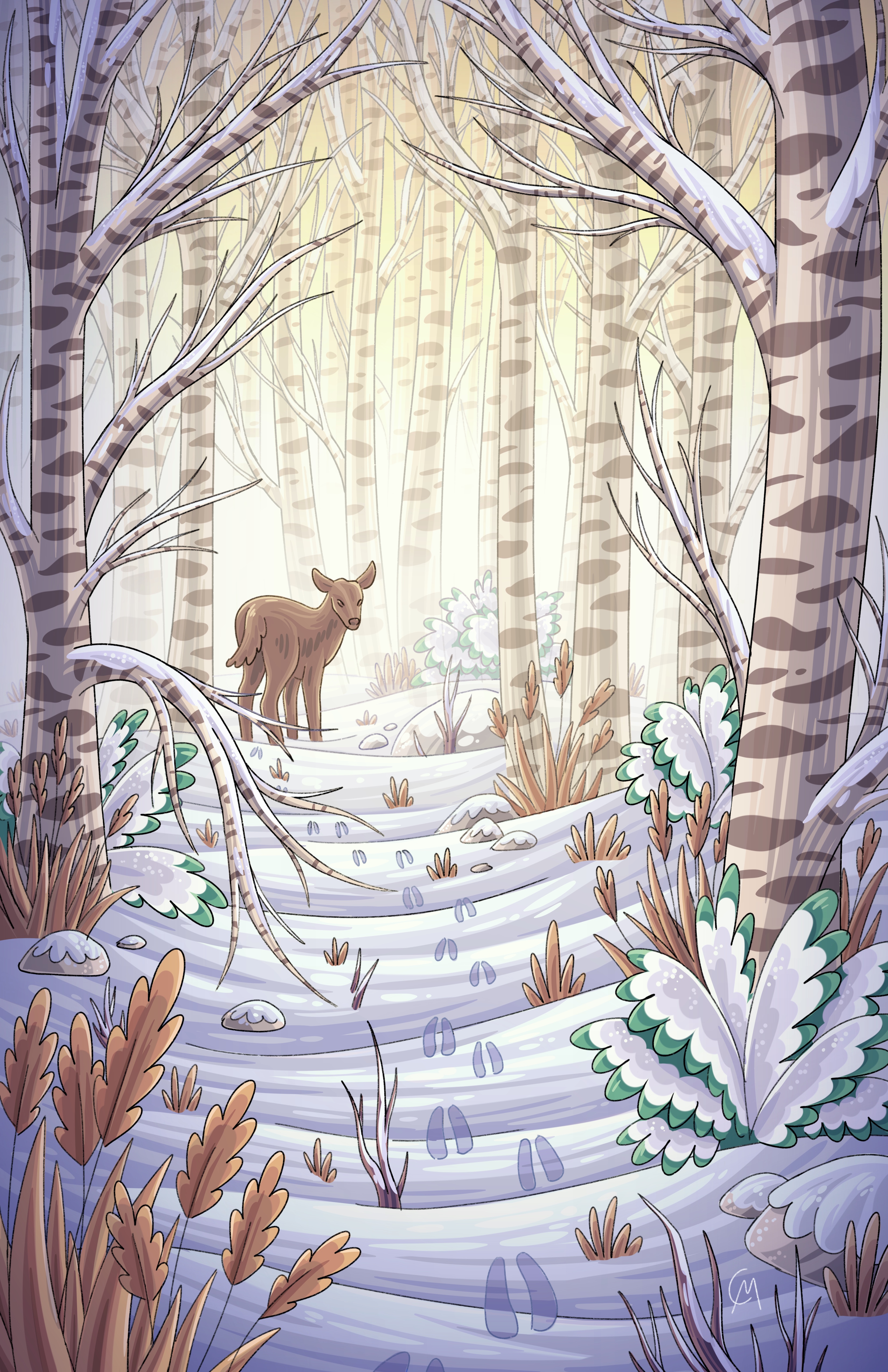 I also made sure to have lighter values around the center of the illustration and darker values around the edges. After this, I began to render the large birch trees. These trees I definitely had to think more about the emerging warm light source so I used a warmer hue for the lighter values and a darker, cooler hue for the darker values. After adding the dark lenticels and snow, I began to lower the opacity further back to slowly merge the receding trees with the bright background. I began to apply this transparency to other elements that recede into the background to wash them out in the warm light. I left the deer alone until I got through most of the piece because I wanted to be a focal point, but I also wanted it to be somewhat bathed in the light. It was a careful dance between extreme contrast to show focus, and unification with the background and overall landscape. Lastly, I went back to recolor some of the line art, as well as add dramatic light and shadow layers to make everything pop. This illustration was a balance between light and dark, and warm and cool and I’m quite satisfied with how it turned out!