
The Future We Were Promised
These past few years, I’ve been feeling nostalgic for the simpler times of my childhood: the mid 2000s to the early 2010s. A time where technologic progress grew and harbored wonder and optimism of a bright future where technology and nature could coexist. Obviously, people during this era could never fathom the direction we eventually headed in, especially in the last couple of years: generative AI, spyware, corporate greed, etc. I know I’m not the only one to look back to explore what went wrong, and what could’ve been. “The future we were promised” is a popular phrase echoed in online communities discussing this time period and the aesthetic that embodied a brighter future, Frutiger Aero.
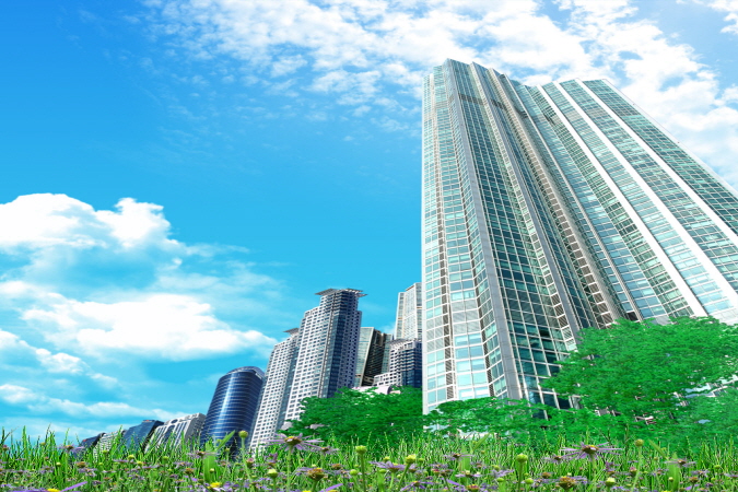
Frutiger Aero is a design style that reigned over tech, user interfaces, and graphic design during this era. This style was composed of glossy, skeuomorphic elements alongside vibrant blue and green color pallets that united nature with technology. This unification showed that technology and nature could coexist and compliment each other instead of being opposing forces. Alongside these common design tactics, frutiger aero also employed, lens flares, aquatic/natural imagery, auroras, and bright blue skies. Frutiger Aero Archive is a fantastic website that dives deep into this aesthetic and does a better job describing and showcasing this aesthetic than I could do in this blog entry. The most helpful aspect of this website was their documentation of the frutiger aero stock images archived from the South Korean website Asadal.com most of which scream frutiger aero. Here are a handful to showcase where I took inspiration for this illustration:


Sketch/Lineart
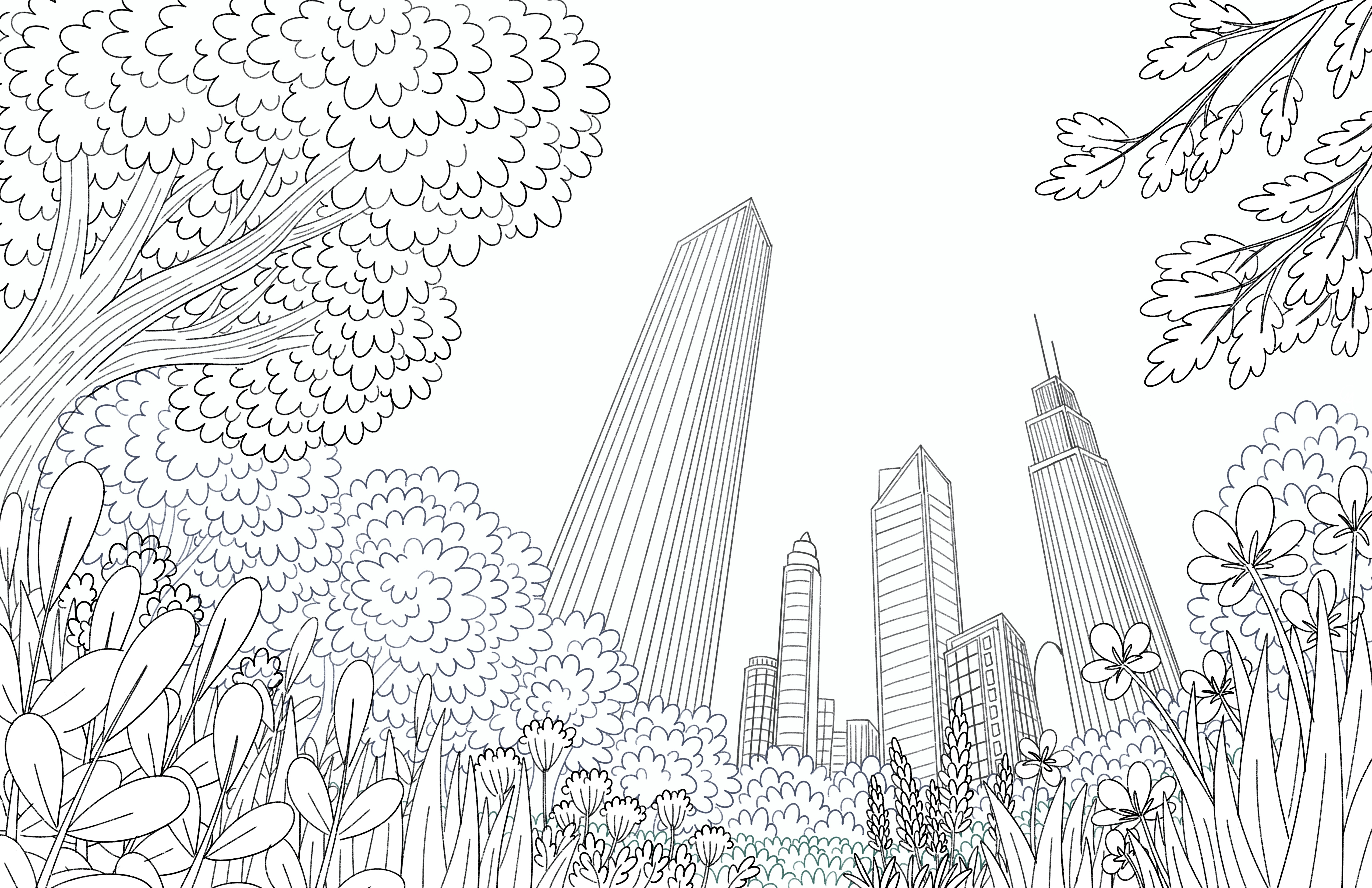
 When sketching out this illustration, I wanted to try a different perspective unlike the typically flat landscapes seen in this aesthetic. I wanted to try out a worm’s eye view as if the viewer is stumbling upon a grand city from a natural, lush forest. Looking beyond the tree line to see towering skyscrapers that cut through the sky, reaching out to the dazzling sun that shines down. This sunlight passes through the buildings, and illuminates the forest opening. I also wanted to add a fantastical element, and a design motif seen throughout many frutiger aero images, fish! These fish swim around as though the air were water, sparking imagination and giving the illustration a “dreamy” and “surreal” quality. In the final lineart, I refined the building in the back so they were unique from one another. I also made sure the foreground elements popped out against the uniform tree canopies. You’ll notice the fish and later bubbles are absent from the lineart, but that's because I added them later to make sure they popped against everything because I felt if I placed them during this phase I’d end up moving them around in the final stages anyway.
Flat Colors
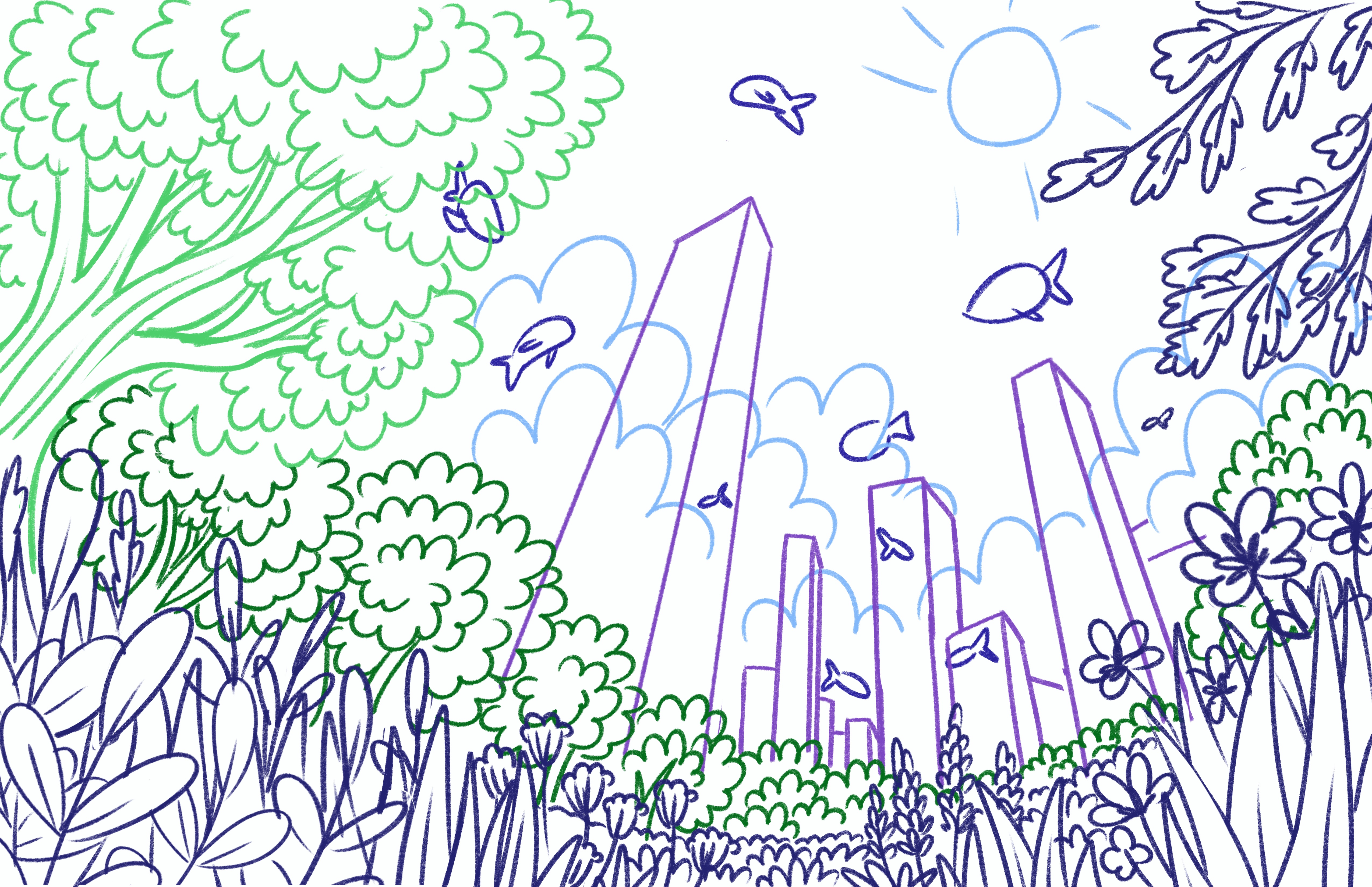
 This section will be brief since the colors I used in this piece are used in most frutiger aero illustrations/graphics: blues and greens. Since there will be a lot of green, I made sure to separate each section to make sure that when I start rendering I can shift these greens so there is more variety. The flowers in the forefront also helps break up the monotony of green which helps bring the eye around and to add more interest. Despite the focal point being the opening in the canopy showing the great blue sky and towering skyscrapers, I wanted to be sure that the foreground was also interesting to look at, maybe not at first, but the more time you spend looking there’ll be more to uncover, like a real forest. When it comes time to render, the skyscrapers will start to blend into the background so for now I left them gray.
Rendering
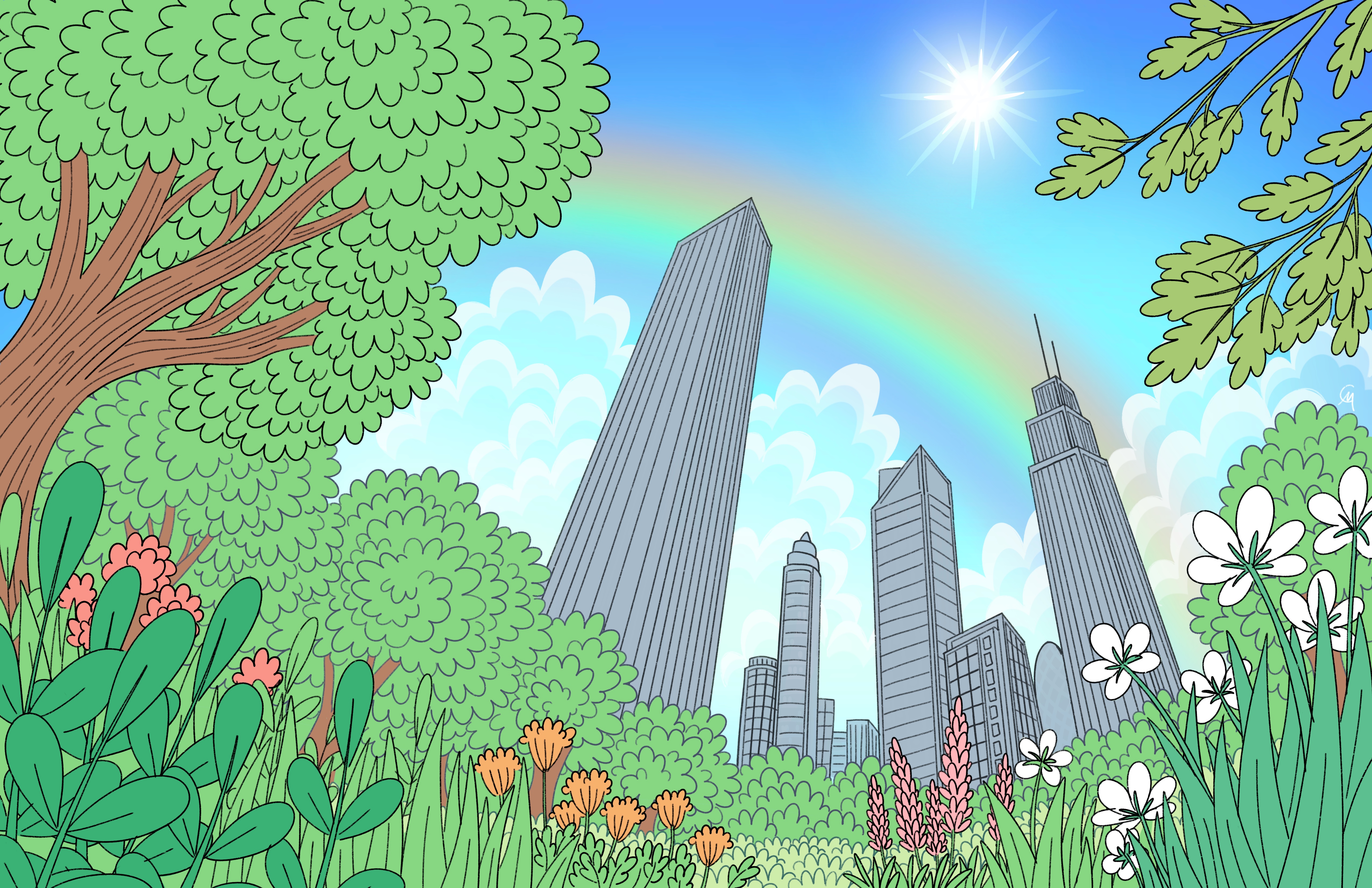
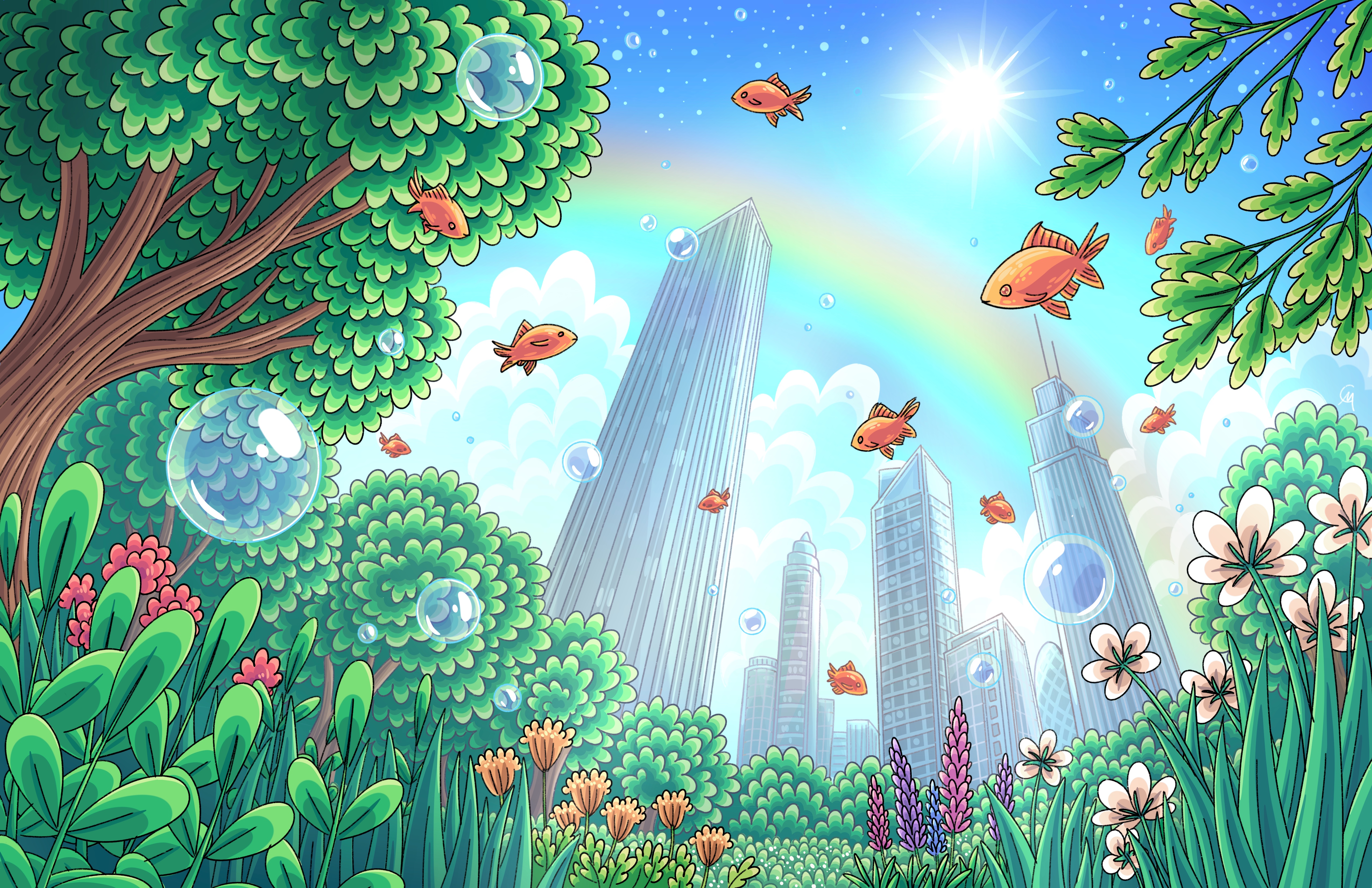 I started with rendering the trees and grass in my typical style, while I shifted the hues of the plants in the front so they stood out from the trees and each other. The cityscape in the background gave me some mild difficulty as I had to balance between making them detailed skyscrapers while making them muddy enough to become part of the background. After multiple different attempts of lowering opacity, shifting hues, and adding subtle lights in windows, I’m quite happy with how it came out. I made sure to pay attention to the glistening sun to brighten certain areas and leave others in shadow. Lastly, I added the school of fish. Despite the millions of tropical fish I could’ve chosen, I instead went with the humble goldfish. The orange compliments the greens and blues, helping the fish stand out from the landscape. I also added some bubbles, another iconic image seen in many frutiger aero images. This provokes imagination, and compliments the fish swimming around the sky as though the two coexist with each other. Lastly, I went over the lineart so that the foreground elements remain black, while further elements began to dull out and blend into the background, lowering the opacity of these elements further to bring them back and almost blend into the vast blue sky. Overall, this illustration healed something within me, and made me contemplate and think about the ideas frutiger aero brings. I’m definitely incorporating these design elements/ideas going forward.